Redesigned Data Changes View
20 March 2026
Back to changelogWe reworked the data changes view to make it easier and faster to spot what changed between two workflow runs.
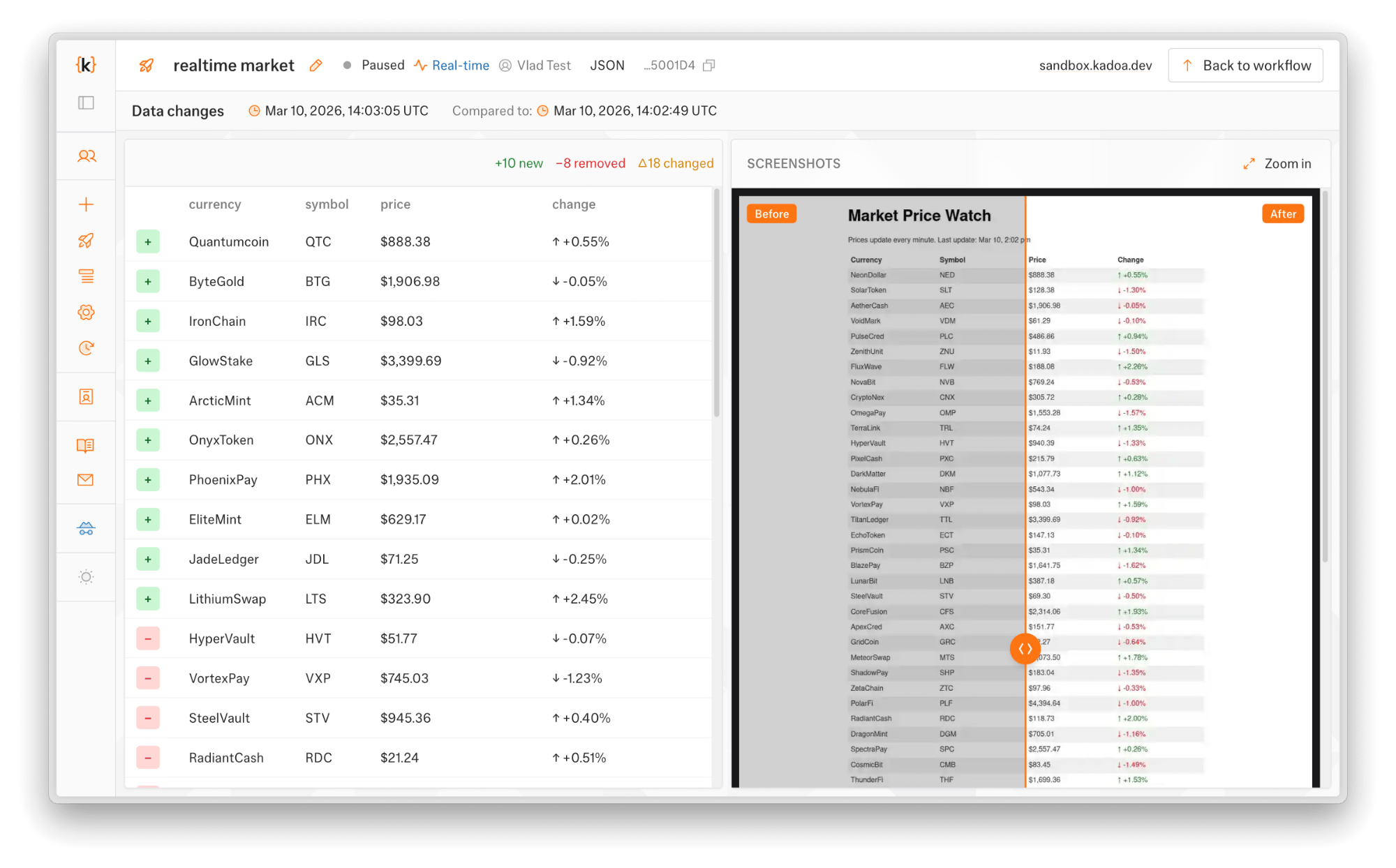
The table now shows inline diffs for changed fields, so you can see what changed in each row faster. A screenshot panel on the right lets you visually compare the source before and after.
If something looks wrong, you can report false positives directly from the change view.
The same design changes got applied to the email change notifications.